Say ‘Hello’ to a New Brand Identity for Benefits by Design
By: Benefits by Design | Tuesday November 10, 2020
Updated : Tuesday January 12, 2021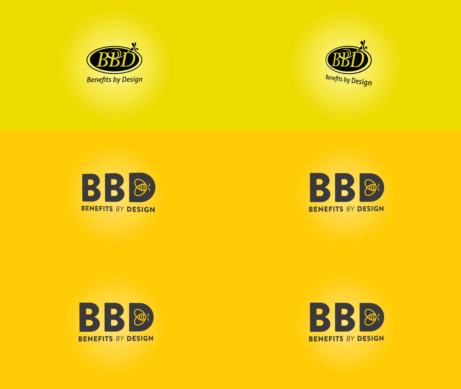
Introducing the our new brand identity!
In August of 2020, we announced the concept of employee benefits by design to our audiences. It was an evolution of the Benefits by Design (BBD) Inc. story that began and ended with a focus on our name — Benefits by Design.
But that was just the beginning. Now, after months (years for some teams) of hard work from all of BBD, we are beyond excited to share the details of our new brand identity!
Why a New Brand Identity?
Excited as we are to share it, you may be asking yourself, “Why are we making this change at all?” Though there are many reasons, the most important all boil down to the same thing: BBD has grown and changed, and it’s about time our brand reflected it.
The BBD Story and Brand Identity has Evolved
Over the years, our company has matured and developed and we’re no longer the BBD we once were — we’re even better! As we grew and changed, learning new things all the while, we needed to ensure that our brand was growing alongside us.
Although we’re diving right into the “benefits by design” part of our name, we’ve come to love the moniker of “BBD” that we’ve earned from our Advisor partners. That’s why it’s the focus of our new logo along with our full name underneath!
We’ve Grown
Our previous brand identity was developed more than a decade ago (2006 to be exact). Since then, the times and BBD have changed drastically. With this rebrand, we knew that we needed to create a simple logo that could grow with us over the decades to come, without losing the essence of who we are.
That’s why your favourite bee is still with us! The bee will be buzzing around the BBD logo for many more years to come. With this new logo comes a more sophisticated and complementary colour scheme, a simplified adaptation of our bee friend, and a bold, standout font.
We’ve Changed… But We’re Still the Same
Confusing, we know, but bear with us here, because while it’s true that with this new brand identity comes change, some things aren’t changing.
We remain the same BBD you know and love, with a belief in the value of individual, group-focused Advisors and a desire to connect working Canadians with strong, sustainable benefits. This new brand identity needed to become more adaptive and flexible without losing the essential essence of who we were or the people we service.
So What is Changing?
Lots of things! Check out some of the new features:
#1. Our Logo and Branding
The most obvious change with our new brand identity is our updated logo, but we’ve made plenty of other changes, too!
We have revitalized our iconic bee icon to be flexible and work as a visual element to represent BBD and the Benefits by Design name.
#2. Our Website
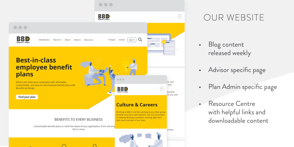
We launched our new website back in August of this year but we wanted to highlight it here. We have a new website that aligns with our new branding and is more inclusive of all of the wonderful people we get to work with every day.
#3. Our Colours
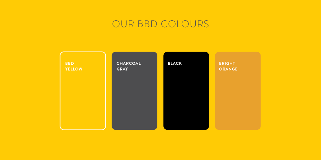
Another change that comes along with our brand identity is a refresh to our brand colours. Yellow and black are still the main colours to really evoke the bee theme. However, the new yellow is more fresh, vibrant, warm, and welcoming and we’ve introduced some secondary colours to round out our palette.
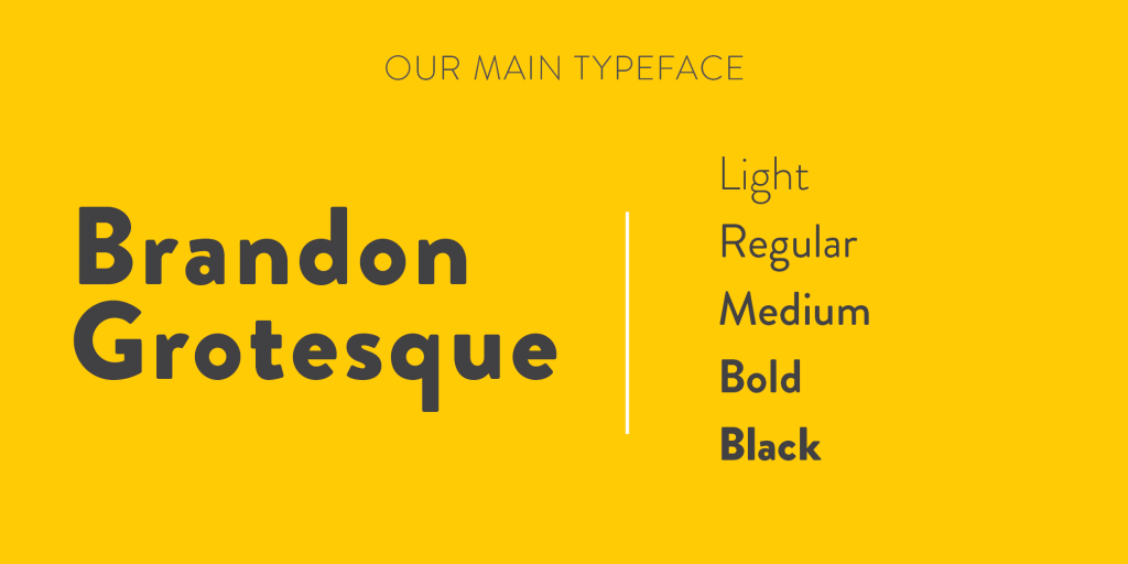
#4. Updated, Accessible Fonts
We have also updated our standard fonts used for documents and websites to be more reflective of our brand. At the same time, we have taken the opportunity to ensure that our font is accessible and easily readable for all Canadians.
Our Continuing Story
While we cannot know for sure what lies ahead, at BBD we can confidently say that we are committed to promoting and protecting working Canadians’ health, wealth, and happiness — now with an updated brand to move forward with us.
And yes, you can still call us BBD.
